terminal city tabletop convention A Brand system with Room to Roam
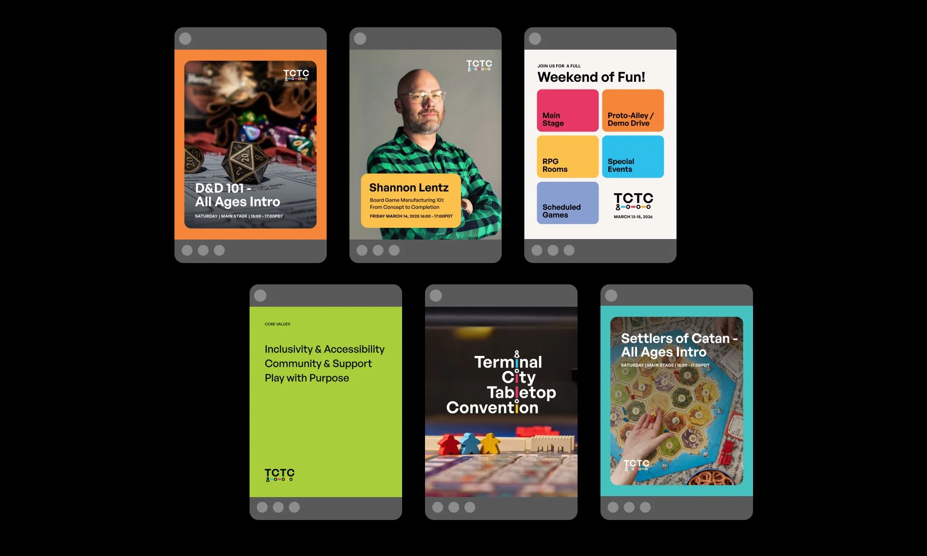
Terminal City Tabletop Convention (TCTC) is Canada’s largest community-driven tabletop gaming event, bringing thousands of players together each year to celebrate connection, creativity, and play. Rooted in values of inclusivity and community, TCTC creates a welcoming space for gamers of all experience levels to gather, learn, and have fun.
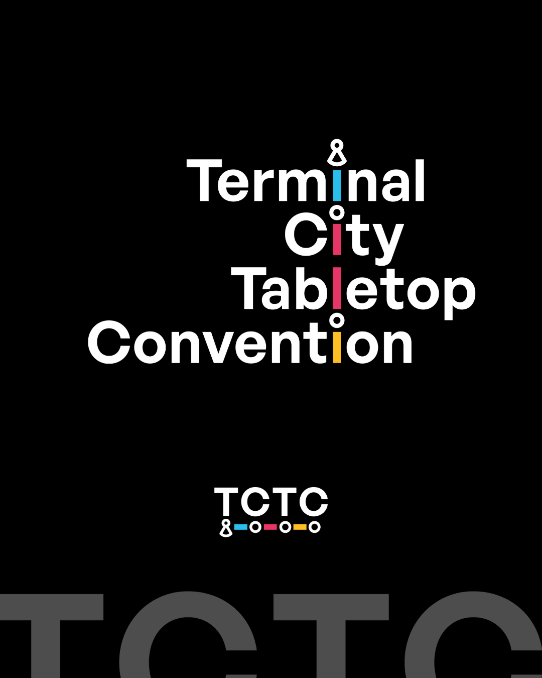
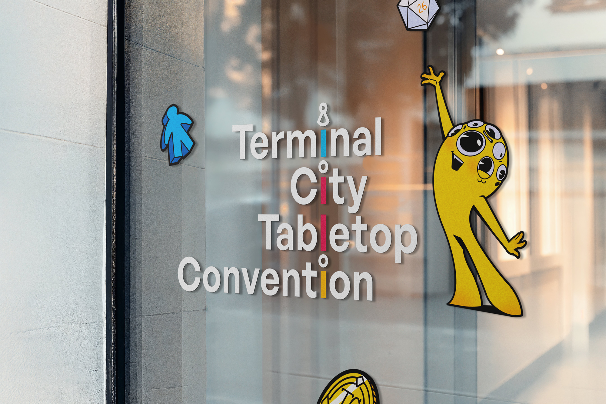
For this project, I redesigned the event’s wordmark to give TCTC a more legible, timeless identity—one that aligns with their annual rotating mascot and reflects the “Terminal City” theme through train-stop–inspired typography.
SERVICES
Brand Identity
SECTOR
Gaming
Before
after
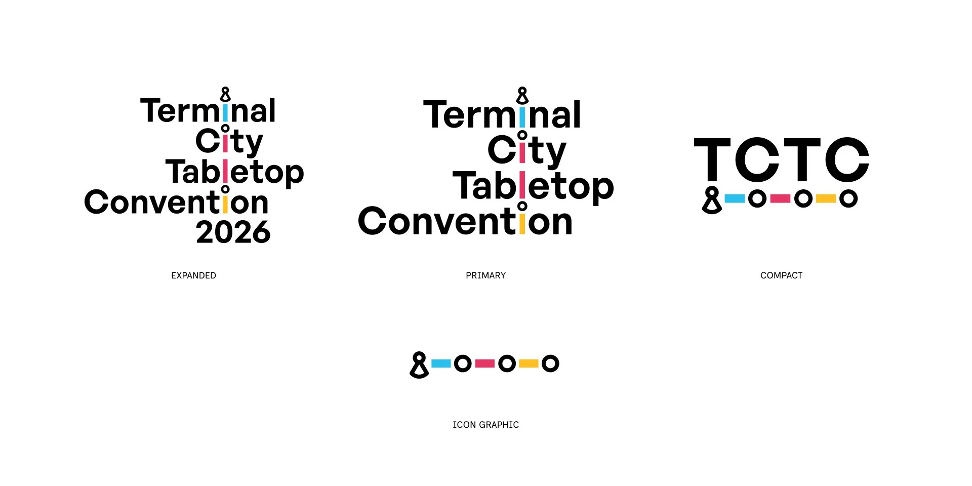
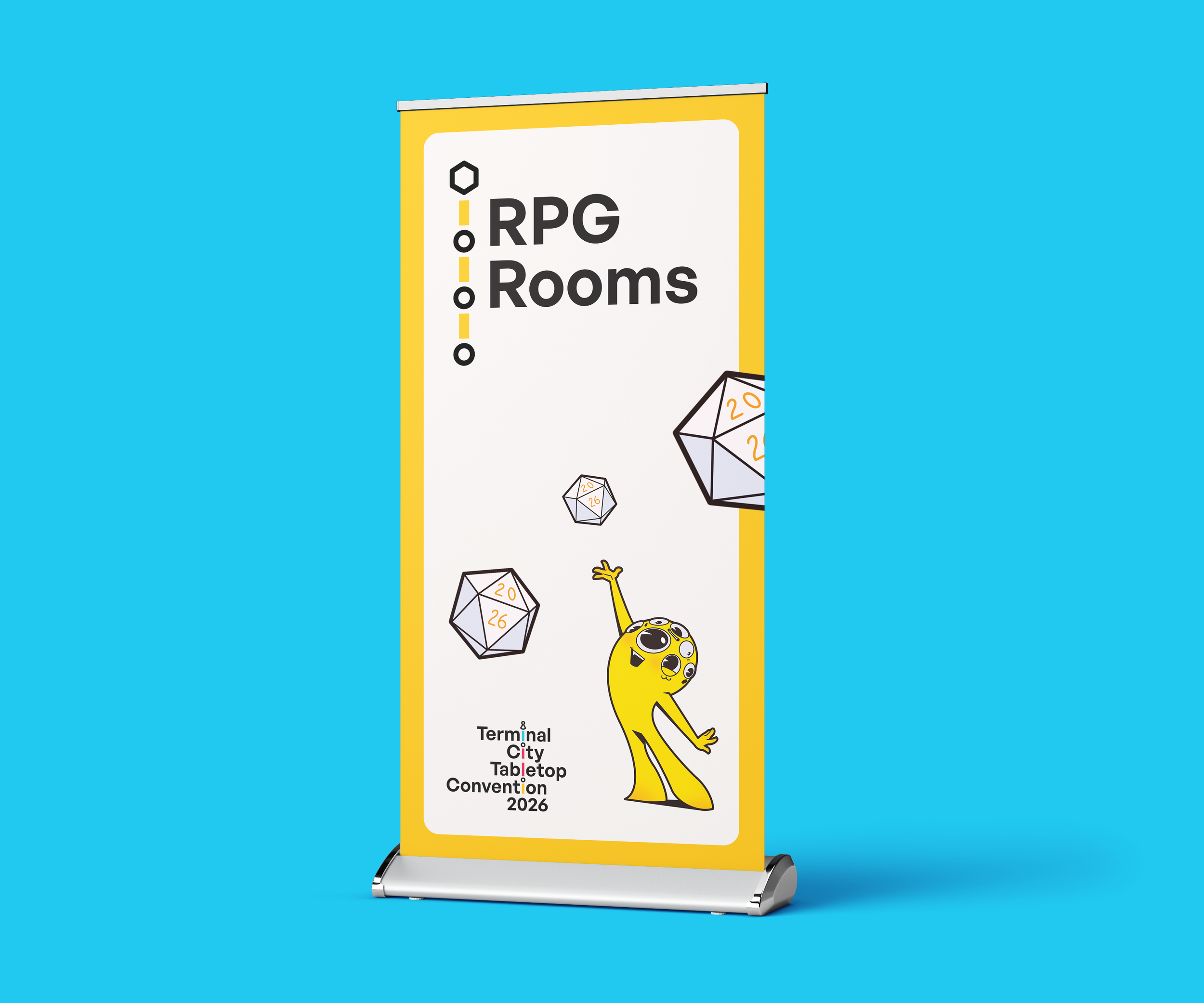
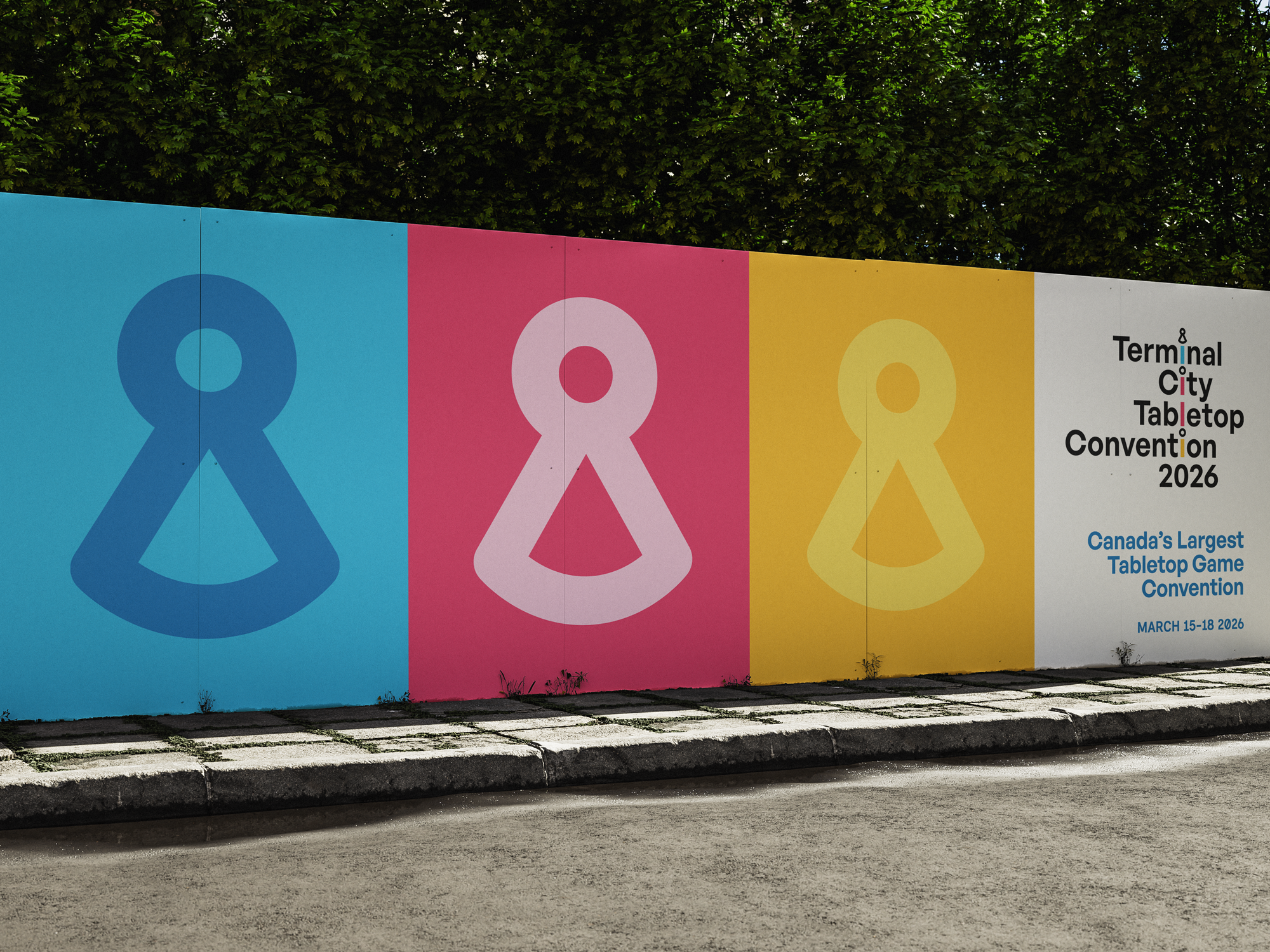
A Wordmark Designed to Grow With TCTC
The goal was to build a visual identity that could stand strong even as the mascot—and the energy of each year—changed. TCTC is all about community, creativity, and shared joy, so the wordmark needed to feel reliable, welcoming, and rooted in the spirit of gathering. Inspired by the idea of “Terminal City,” the final design echoes a transit line rising toward a shared destination, symbolizing movement, togetherness, and the welcoming journey that brings players back year after year.