

CREATIVE DIRECTOR
Tim Choy
PRODUCER
Chris Milani
I was honoured to be a part of the team that brought to life a few of TED's educational courses, featuring Dylan Marron, Pico Iyer, Charlie Jane Andersand Wanuri Kahiu.
Through this project, we developed a unique visual language for the illustrated graphics of each course to support and enhance its content, tying the character and personality of each instructor to the graphic aesthetic. Alongside each course, I created workbooks in both digital and print formats to accompany the animated explainers and support viewers in their reflections.
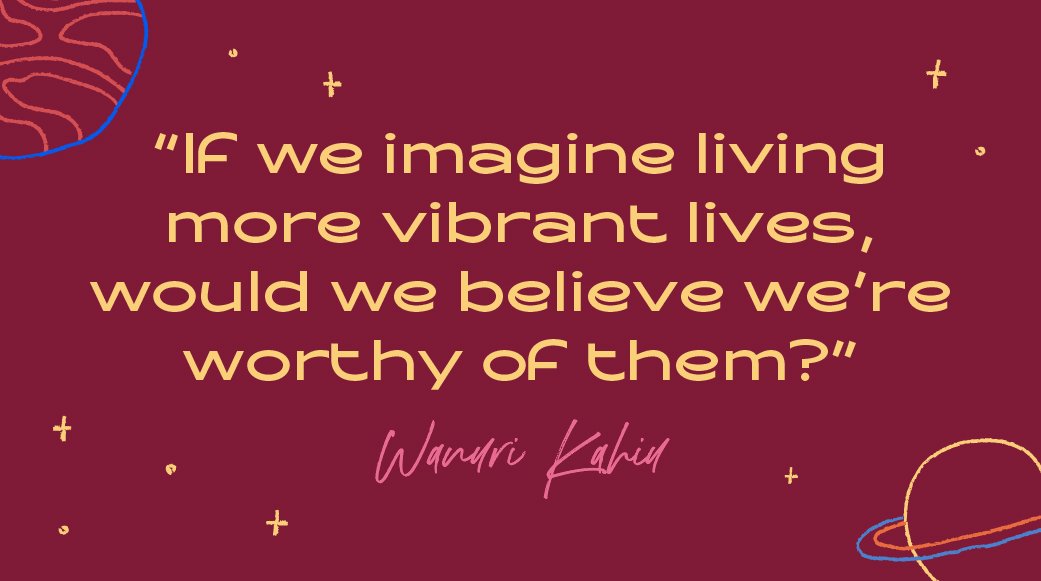


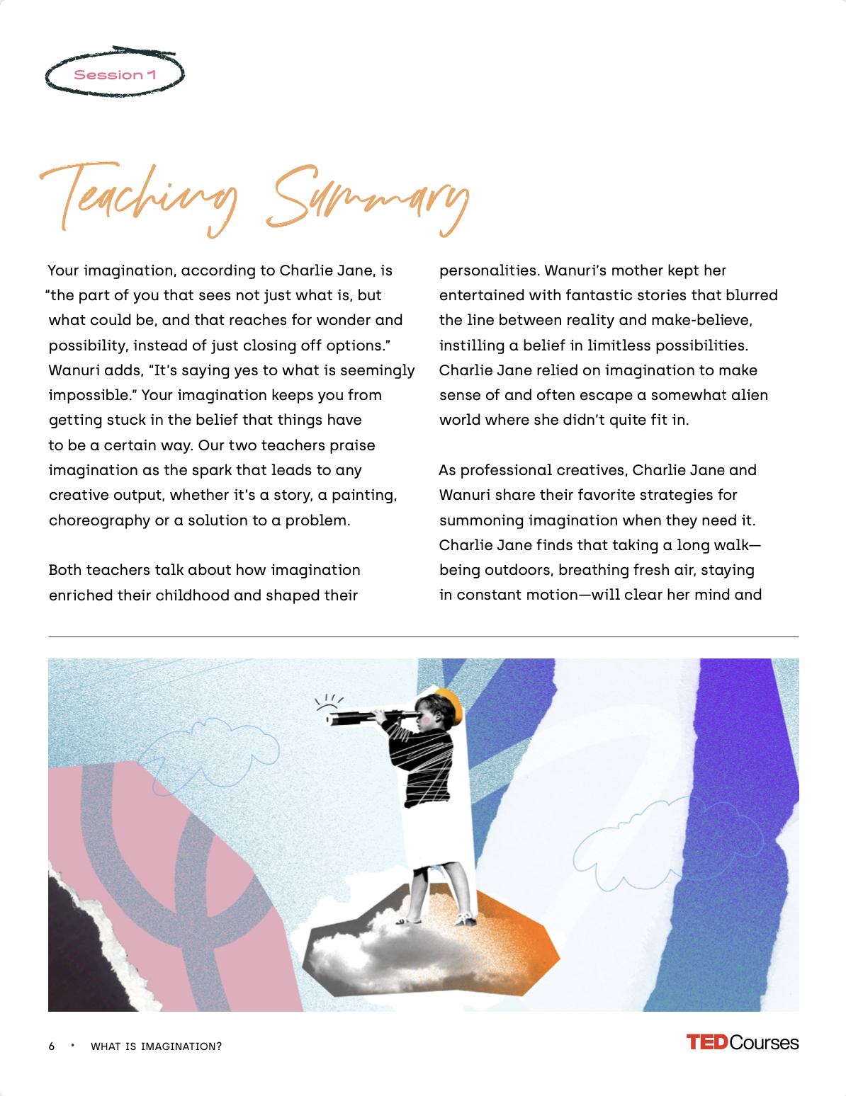


How to Nurture Your Imagination
by Charlie Jane Anders & Wanuri Kahiu
The art style for How to nurture your imagination by Charlie Jane Anders and Wanuri Kahiu explores different types of self-expression by bringing more playfulness and curiosity to the visual language we developed.
Our visual approach to the workbook uses collage aesthetics and simple line drawings to create visual interest and contrast between the joint teachings of Charlie and Wanuri. Using a warm color palette and more hand-written font, the visual aesthetic of this workbook invites participants to be more expressive and loose by exercising their imagination through various activities.
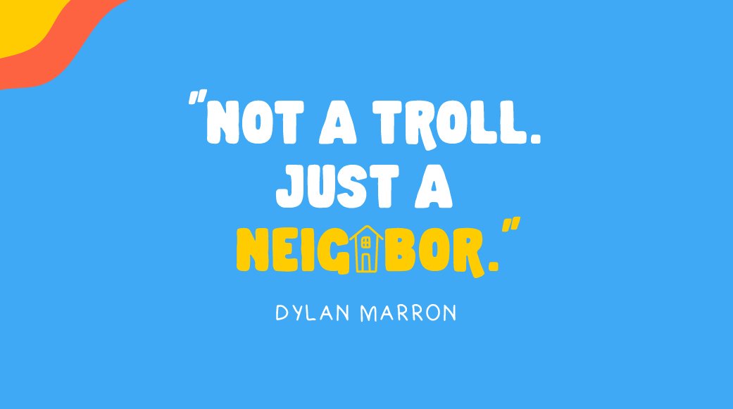
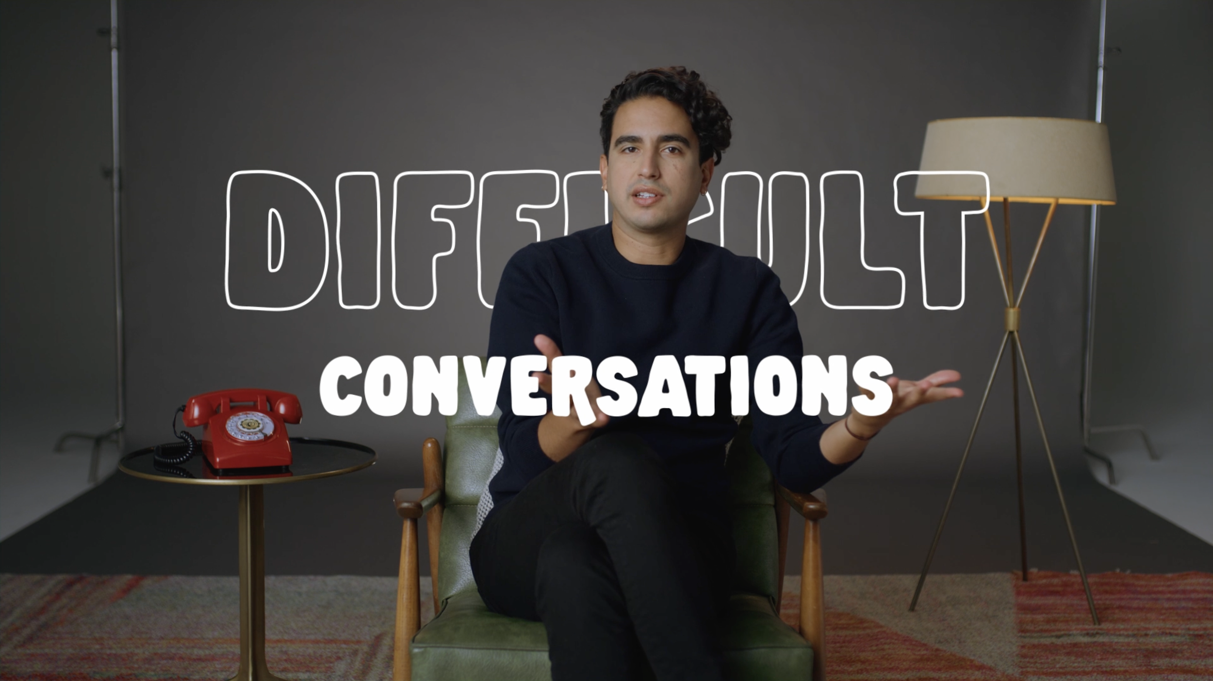

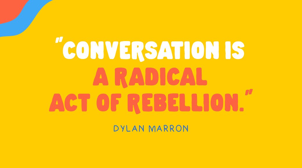


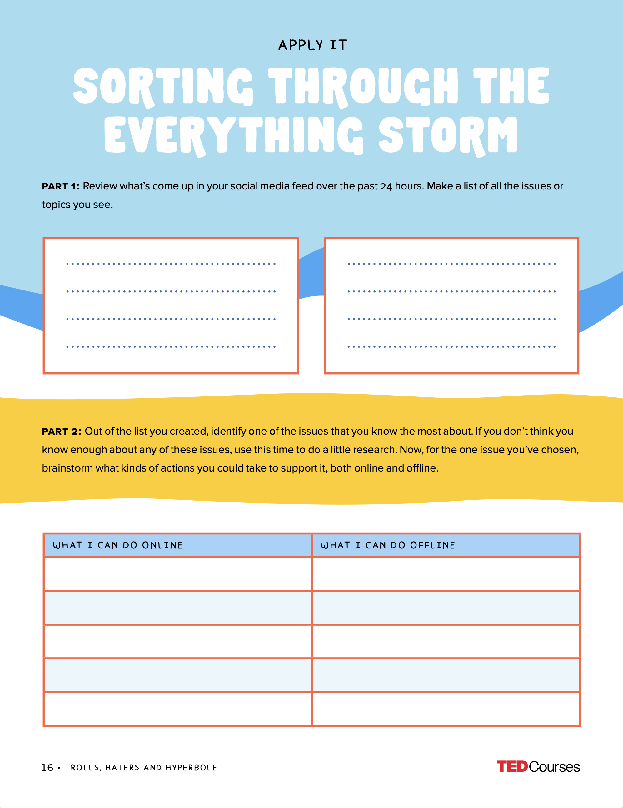

How to Disagree
by Dylan Marron
The creative approach surrounding How To Disagree by Dylan Marron focuses on bold, colourful art styles to convey the dynamism and diversity of conversations and different perspectives.
To compliment Dylan’s charming demeanor and professional presence, the graphic content for the workbook was primarily type-driven, using a bold yet organic typeface to help convey an inviting and playful tone for an otherwise complicated subject to unpack. It also uses vibrant colors that lean towards warmer tones to create a more inviting atmosphere for the context of the course.


How to Flip the Script on Love
by Mandy Len Catron
For Mandy Len Catron’s course on How to Flip the Script on Love, the font style uses a playful sans-serif for the primary content to bring an approachable, accessible, and unpretentious tone. By contrast, the body text uses a serif font to reference literature and academia, reinforcing the credibility of an academic voice.
The graphic elements we created use a combination of solid shapes and hand-drawn elements to create visual interest and contrast. While the solid shapes bring a grounded strength to the content, the hand-drawn elements suggest ownership and control being given back to the viewer.